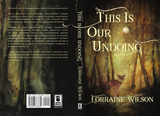
Did you see it on the homepage? Isn’t it pretty? Just in case, and because I want to, here it is as a spread so you can see the way the curlicues in the physical book will extend over to the back – a facet I am particularly fond of!

I wanted to talk a little bit about the process of developing a cover, as it was something Francesca at Luna was lovely enough to involve me in and it was a genuinely fascinating process.
The first stage for me was when Francesca told me they had approached an artist about the cover art (see Luna’s blog about it here). This happened way earlier than I expected and so I hadn’t had a chance to mention some of my thoughts on a cover, or to ask what my level of involvement would be. I was, if I’m completely honest, a little nervous at this point, worried that the artwork would really, really not be what I wanted. There was one thing in particular I was not wanting, and one thing I was…
The Not Wanting was human figures or faces. I love these on other covers, I have nothing against people’s faces in general, and I cannot even articulate why this felt so fundamental to me. I think part of it is not wanting to see how someone else visualises ‘my’ characters, and also not wanting readers to go into the book with someone else’s versions in their minds. The funny thing about publishing a book is that it ceases to be yours. But I do believe it ceases to be any one person’s, so I guess I was just leery of having one person define the characters for others. Does that make sense? Possibly not.
The Wanting on the other hand was (ironically) a different figure … a fox. I know. Isn’t that awesome? Why I wanted a fox is tricky to explain without spoilers so I’ll just say this: That to me foxes came to symbolise that dichotomy of fierceness and fragility which I think lies at the heart of a lot of my characters. They also capture a sense of the wild – the intangibility of the forest and the night. Plus they are cool. There is no carnivore more adaptable or resilient, few as floofy, and none that can pounce into snow banks with such perfection.
So, as should now be clear, when my publisher sent me through the artwork … I was stunned. Because without knowing, she had given me exactly what I had been hoping for. She said she had mentioned poetry and darkness, the fox and the forest to Daniele Serra (find him here), and I realised two things – that she saw the very same heart in the book as I did, and that seeing beautiful art that is going to be ON MY ACTUAL BOOK makes me cry.
So we have a beautiful piece of art that it would be sacrilegious to stick words all over … and then we started sticking words all over it. This was the part of the process that I was deeply involved with, and I can only be grateful that Francesca was so patient with my (many) suggested tweaks, minor worries and last-minute second-guessing. We settled on a font pretty quickly because squiggles. Then it was all about placement, and man, are there a lot of possible ways to position words on a page. A. Lot. And then, just when you think you’ve nailed it, you have to do the hardback version (I am still very excited to have a hardback version), and then an ebook version (as you can see above, the physical version has curlicues passing over the spine, which in an ebook 2D version looks a little odd. So back to the shuffling words and squiggles (and more last-minute second-guessing), until we had the version you can see on the homepage.
THEN I got a little carried away putting together pretty graphics like the one on the homepage, and the ones I’ll be sharing on Twitter and Instagram. But the story of that particular procrastination device/learning curve is for another post. Let me just finish by saying that it is an honour to have such beautiful art on my book, and seeing it makes the whole seem so much more real and precious. Yes, there may have been tears at seeing the final versions too, and also some slight dancing.