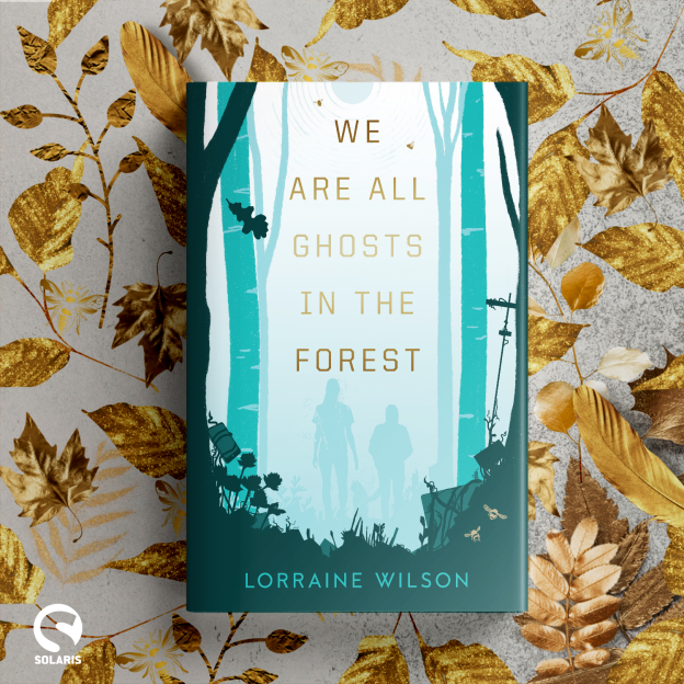
Today is Cover Reveal Day for We Are All Ghosts In The Forest! I love cover reveal days – they’re the day you can entirely unself-consciously gush about your book because you’re gushing about someone else’s work which removes (almost) all the imposter syndrome, awkward self-promo feels of your standard bookish promo events.
If you’ve managed to miss me hollering on social media – here is the gorgeous creation of Jo Walker, which I think captures so much of the essence of Ghosts from the colour palette to the tiny details.
Rather than just finish the blog here with an I HOPE YOU LOVE IT, I figured it might be interesting to talk through the process of cover designing in trad pub and perhaps share some ideas for how you the author can best intersect with that to increase your chances of getting the cover of your dreams.
Sound good? Okay.
[A version of this blog was shared on my Substack in January. Where-ever you read it, thank you for your interest and support]
I’m not as visual as some, so when I have a finished book my sense of what I want the cover to look like is generally quite vague. For my first book, I could only say ‘I don’t want people’ and ‘Moody, maybe with foxes.’ Which is … well it’s better than nothing. But there are several hundred directions that premise could take and many of them wouldn’t have really fitted my inner vague sense of the book.
Incidentally, I got extremely lucky with my first book in that my publisher spotted a new piece of art by award winning cover artist Daniele Serra and knew instantly that it fitted the book perfect. So my vagueness didn’t shoot me in the foot and I adore my moody fox with no people cover!
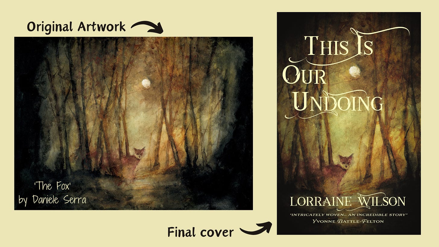
Buying the rights to a pre-existing piece of art is a slightly unusual process though. In most cases a book cover is created specifically for the book according to a cover brief given to the artist.
By my second book, I’d figured out that I needed to think more clearly about what I wanted. Now, I look for covers of books that both fit in the same marketing space and have stylistic approaches I like. I look up the designers of covers I admire and check out their portfolios. I try to come up with a list of aims that are more than ‘make it dreamy?’. Such as – ‘I think a minimalist & slightly eerie foresty vibe would work really well’ (Ghosts) or ‘I’d love lush tropical colours, including animals that are motifs in the book, and reference to the sea’ (Mother Sea).
And so for all my subsequent books, I’ve gone to my editor with some comp covers, a set of specific vibes that I want to convey, and some stylistic or design elements I am keen to see.
This step can take the form of a conversation in a bookshop (my second book), some email back and forth about comparative covers and photographs (my third book), or me sharing Pinterest boards and comparative covers, and us both pulling together a list of potential artists (We Are All Ghosts In The Forest).
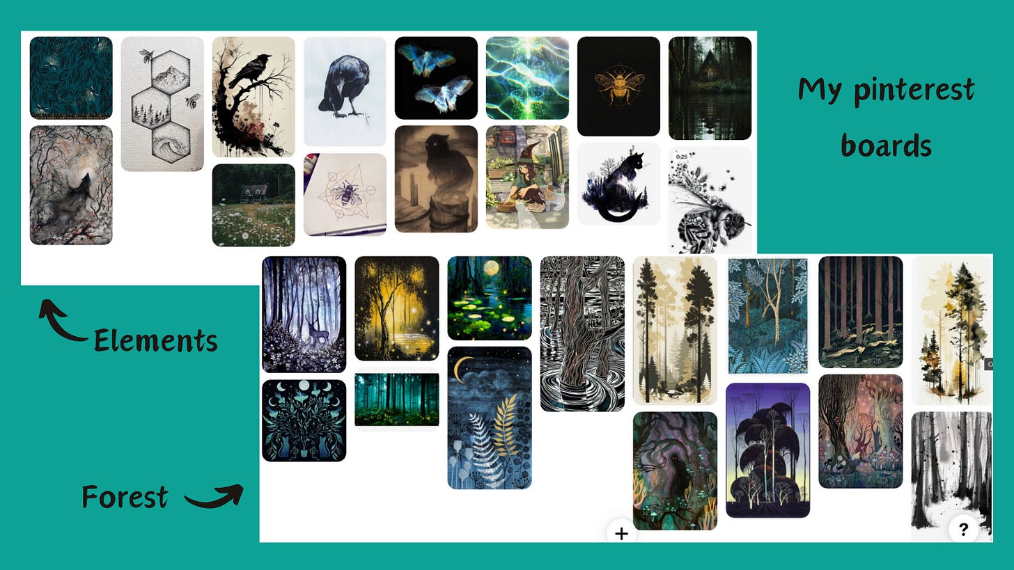
Once you and your editor have agreed a direction, your editor puts together a cover brief which contains all the above information, along with relevant themes and motifs, plot points and market placement aims. The cover brief my editor put together for Ghosts was amazing (I wish I could share all of it), and incorporated elements from my Pinterest board, many of my suggested cover comparisons, and some incredibly exciting author comps as well.
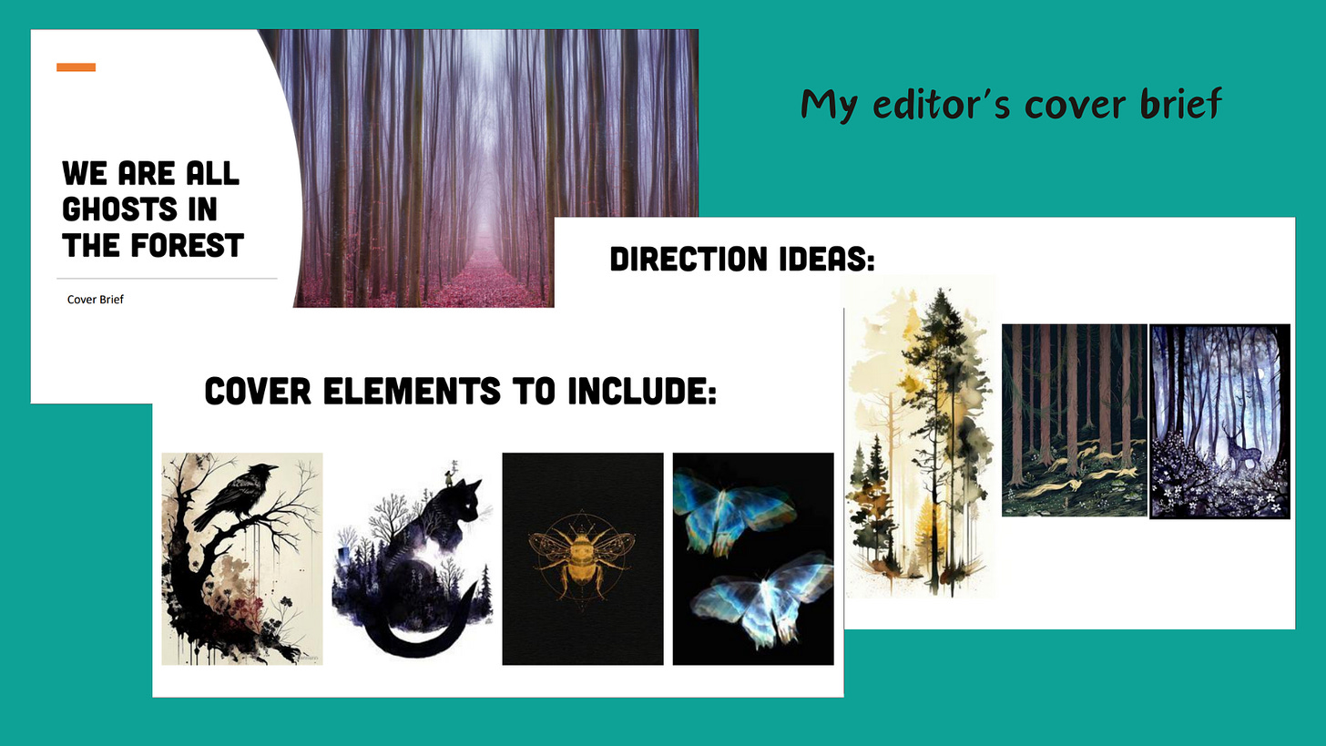
The next steps happen without author input, usually (but see below).
With the sign off of Marketing and Publicity (and Mysterious Others), this cover brief is then sent to whichever cover artist is hired for the job. We had a list of top favs, and which one we went with was a juggling act of their vision and availability versus our deadlines. The limits of my involvement in this stage was saying ‘fabulous’ once the artist was confirmed.
Normally, the artist provides a selection of initial cover visuals to the publisher and they go through a process of development to come up with a single draft cover before this is then shown to the author.
With my second book, publishing with a small press meant that I was more closely consulted at this stage. I got to see all the prelim draft versions, pick the elements that I liked and ask for fairly substantial changes in an iterative process that went from entire colour/layout changes to tiny tweaks of font size and contrast levels. While this isn’t something I can expect from most books, it was an incredible learning process. (Check out Jay Johnstone here)
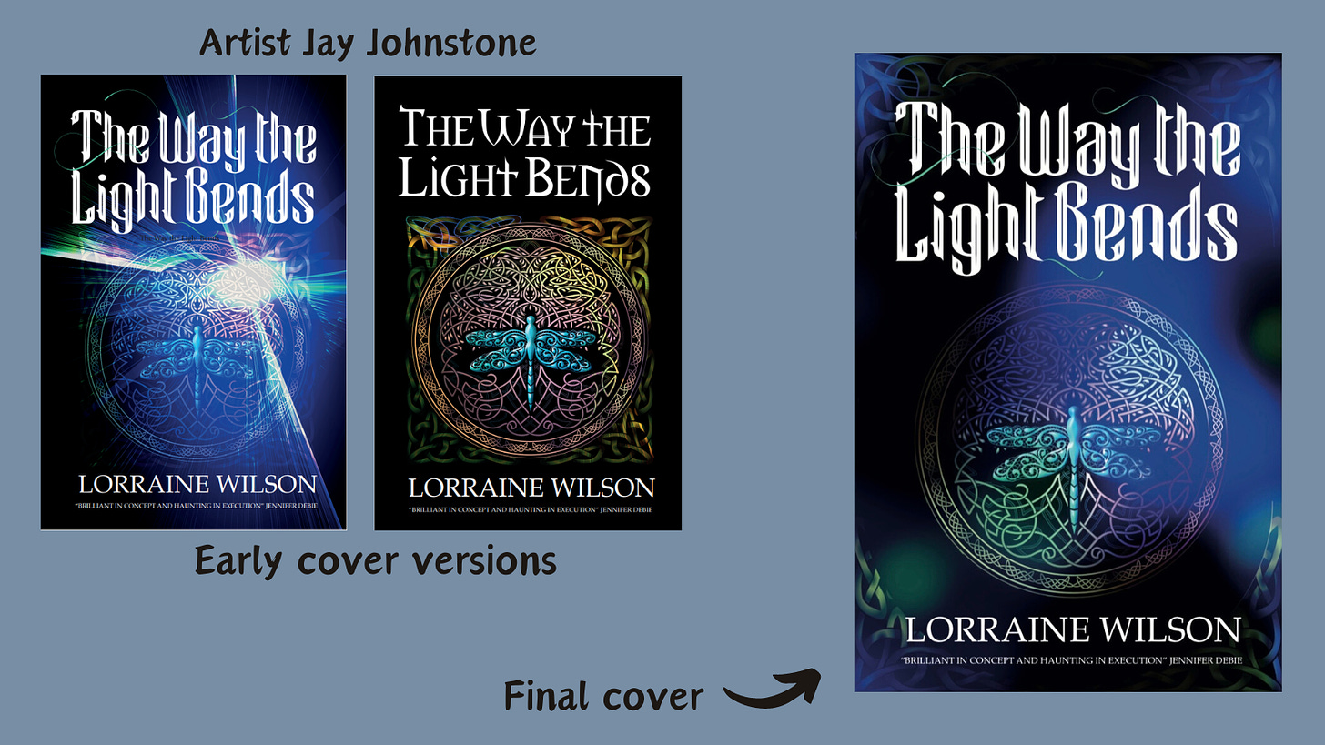
With Ghosts, I was sent a draft cover that had already been through revision in-house. It was beautiful, and very much in line with how I’d envisaged it. There were a few tweaks I wanted though, and after consulting my agent to confirm, I sent this list of requests back to my editor. Now, the bottom line in all of this is that the publisher has final say on covers. Contractually, authors are to be consulted, but not obeyed, so to speak.
With Mother Sea, to be honest this draft was so sublime, I made one request about the title font, which was adjusted, and that was it.
I was a little nervous sending a few more tweaks for Ghosts, so was super grateful when my editor came back with ‘Yes, I agree with all of this, will send it on’. Happy days.
I then got sent a ‘final’ version to agree, which was amazing and incorporated all my requests. But there was one small detail I felt still needed tweaking. I asked; this time my editor said ‘maybe. it depends.’ Which is entirely fair. The artist was working on commission and that buys only so many hours of work. So I get it, and even if they couldn’t make that last change, I still fortunately had a cover I love.
Do I have to love it? Maybe not, but I do have to believe it will help sell the book. We are going to be looking at this cover SO MUCH over the next year or so. I’m going to be taking it to bookshops, sharing it online, using it to pitch myself for events. I have to trust that when I show it to someone, it will give them both a fairly accurate sense of the book, and also make them want to pick it up.
It is easy, as with editing the book itself, to get tied up in tiny details. To worry about comma placement, exact shades of green, the length of chapter 27, the perfect placement of the title to the millimetre. And yes, those things matter. But also they don’t? At some point we are fiddling with things that no shop browser or reader is going to spend more than 3 nanoseconds on, so it’s okay to step back and go – it’s fine. I’m happy. I trust it.
Which is what a lot of it is about, I think. Trust. Trusting the publishing team to know what will work for your book, trusting your gut, trusting your book to stand without you in the world and do its job on its own.

Conversely, if your gut is telling you this cover is wholly wrong for your book, then step 1 has to be to talk it through with your agent if you have one. How much is simply that you aren’t familiar with current trends in cover design in your sub-genre? How much is a genuine disconnect between where you see your readership and where your publisher sees them? I’m very lucky I’ve never had to deal with this particular minefield, but if you find yourself in it, speak to your agent. Ask trustworthy friends who both know your book and know enough of publishing to give an honest, informed take. It’s hard to find the line between standing up for your book and not trusting the expertise of others, but resolving a sticking point can only happen through gentle, clear communications. Ask me, if you like! I’m happy to offer my semi-informed opinion!
I love the cover design stage. I love the joy of pointing at beautiful covers of books I admire, and saying ‘I’d like something like that please’. I love the absolute wild magic of sending a set of bullet points and random pictures to an artist and them somehow, miraculously producing something that captures the essence of your book. How? They are amazing creatures, cover designers, and deserve far more recognition than they generally get.
Did I get my final adjustment? No. Does it matter? I’m glad I asked, I would have regretted not asking and I think my suggestion was a valid one, but I still have a cover I both love and trust, and have been bursting with the urge to show it to everyone.
With the cover of Mother Sea I usually shove it at people, shouting LOOK AT THE CRAB. With Ghosts, I think it’s gonna be GOLDDD BEEEEEEEES.
